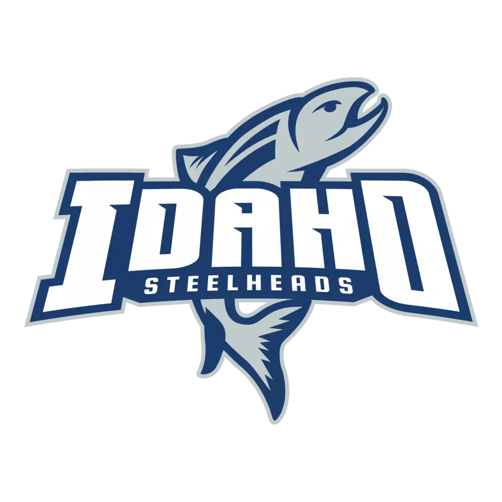
Steelheads New Logo
The Idaho Steelheads unveiled a new logo today both primary and secondary!
It's not so much a change but a refreshing of the Idaho Steelhead logo said Steelhead President Eric Trap, “We felt the logo needed a refreshing. The balance of it certainly is better now and we think the design and the lettering are sharper, but we’re also preserving the mark our fans love and identify.”
The Steelheads’ new primary logo preserves the features of their previous logo, with the vertical Steelhead fish underneath the team name. The logo has been altered with a different font and a new color scheme to offer a more sleek and modern dynamic.
The Steelheads say they will incorporate shades of black, silver, and navy blue in their uniforms. Different but not so different to maintain Steelhead tradition says head coach Neil Graham, “We’re going into our 21st season and it’s kind of the mark of a new era but It’s important to remember where we came from but it’s also important to evolve and stay current.”
The new alternate logo above and third jerseys added this season will be more unique, worn at select home games during the season. Again it serves as an effort to modernize a variety of looks that Steelheads fans know well.
More From Power 105.5
